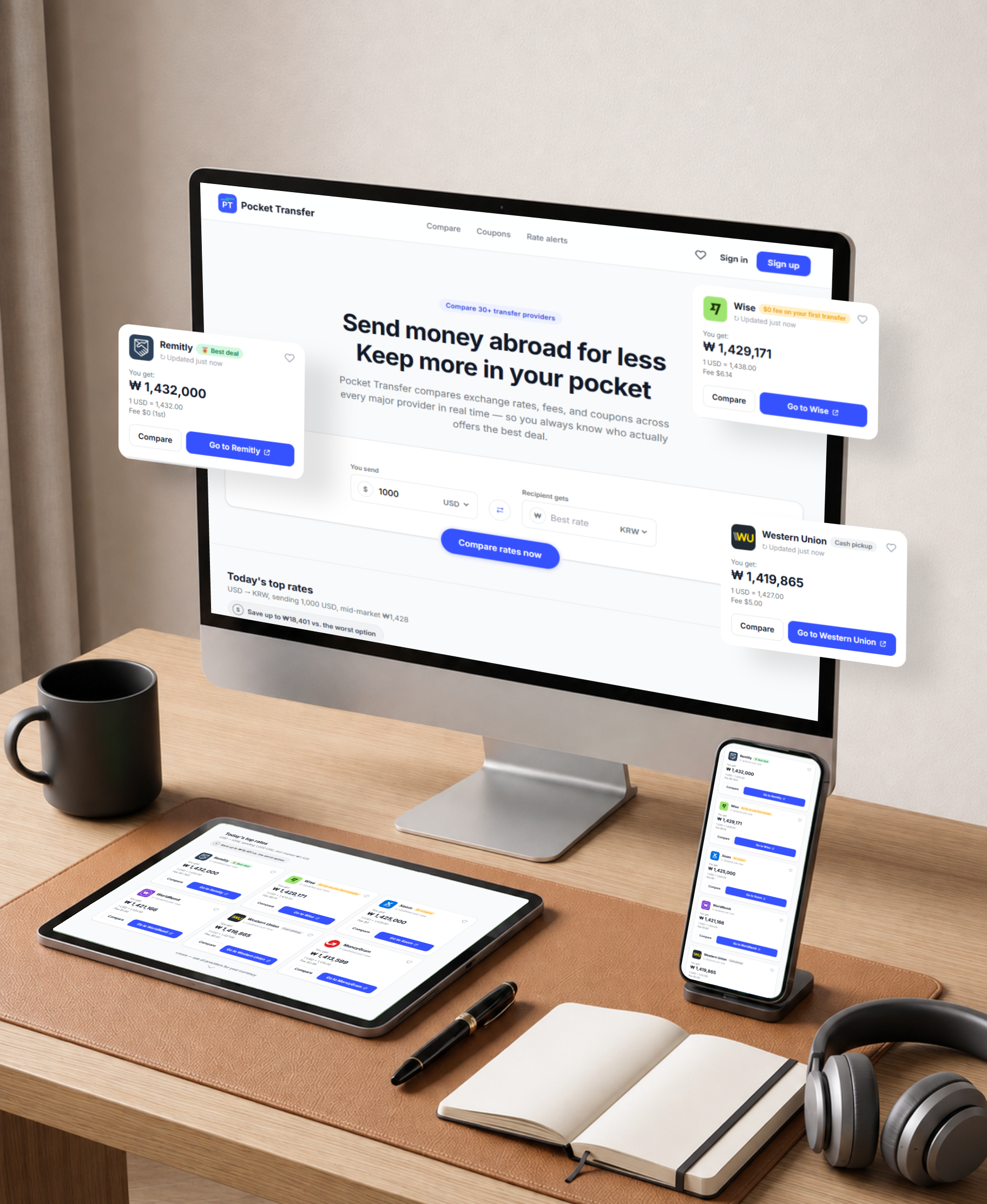
Pocket Transfer compares exchange rates, fees, and coupons across every major provider in real time — so you always know who actually offers the best deal.
People sending money abroad must manually check multiple provider sites, where hidden fees and marked-up exchange rates make true costs hard to compare. As a result, many overpay without realizing it.
Design a web app that shows the true total cost of a transfer across providers in one view, so users can choose with confidence and save money on every transfer.
Pocket Transfer aggregates live quotes and reduces each option to a single "recipient gets" amount — rate markup plus fees minus promotions — for international students, travellers, and people who live abroad.
I ran remote interviews and surveys with 12 people who send money internationally at least once a month. Going in, I assumed users cared most about the exchange rate alone. Research showed the real struggle is comparing total cost — rate markup plus fees minus promotions — across many providers, and that users distrust "zero fee" claims. This shifted the design toward one transparent "recipient gets" number per provider.
"I just want to know which service actually gets the most money to my family — without doing math on five different websites."
Mapping Amara's journey of sending her monthly remittance revealed friction before the transfer even begins: gathering quotes, re-checking expiring rates, and hunting for promo codes. This pointed to the comparison stage as the biggest opportunity for improvement.
| Stage | Actions | Feeling | Opportunity |
|---|---|---|---|
| 1 · Decide to send | Checks family needs, payday timing | Motivated | Show live rate for her saved corridor |
| 2 · Gather quotes | Opens 5+ provider sites, notes rates and fees | Frustrated | Aggregate live quotes in one view |
| 3 · Compare costs | Builds mental math of rate + fee − promo | Overwhelmed | One "recipient gets" number incl. everything |
| 4 · Choose provider | Second-guesses "zero fee" claims, re-checks | Anxious | Transparent breakdown + trust signals |
| 5 · Send & confirm | Completes transfer, tells family | Relieved | Deep-link handoff with locked-in quote |
I built flows so personas can complete key objectives while reducing existing pain points — a Compare path with a customizable quiz and filters (total, lowest rate, lowest fee, fastest, safest), plus Deals, Rate alerts, and Account branches feeding into a single result that deep-links to the provider.
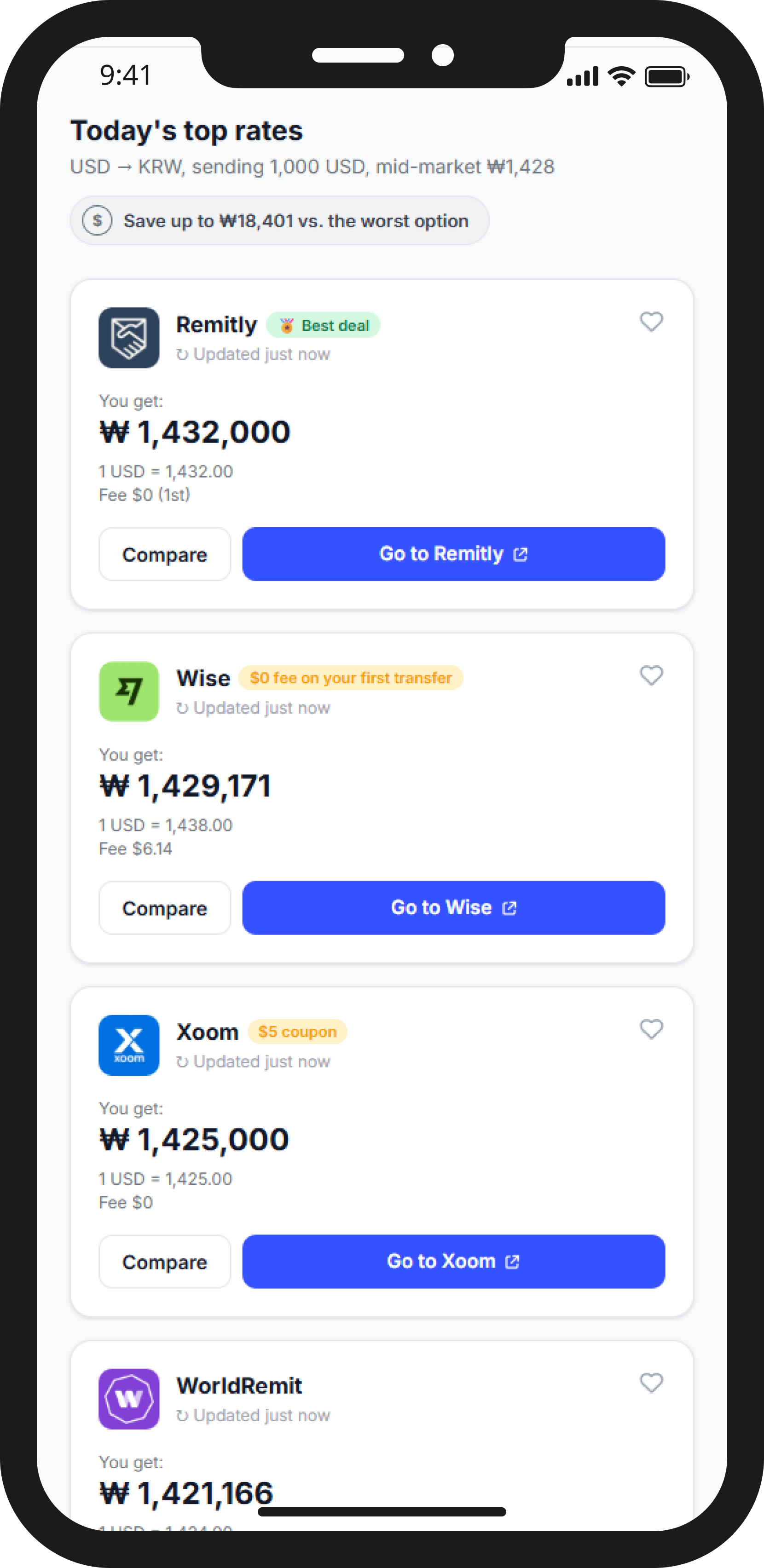
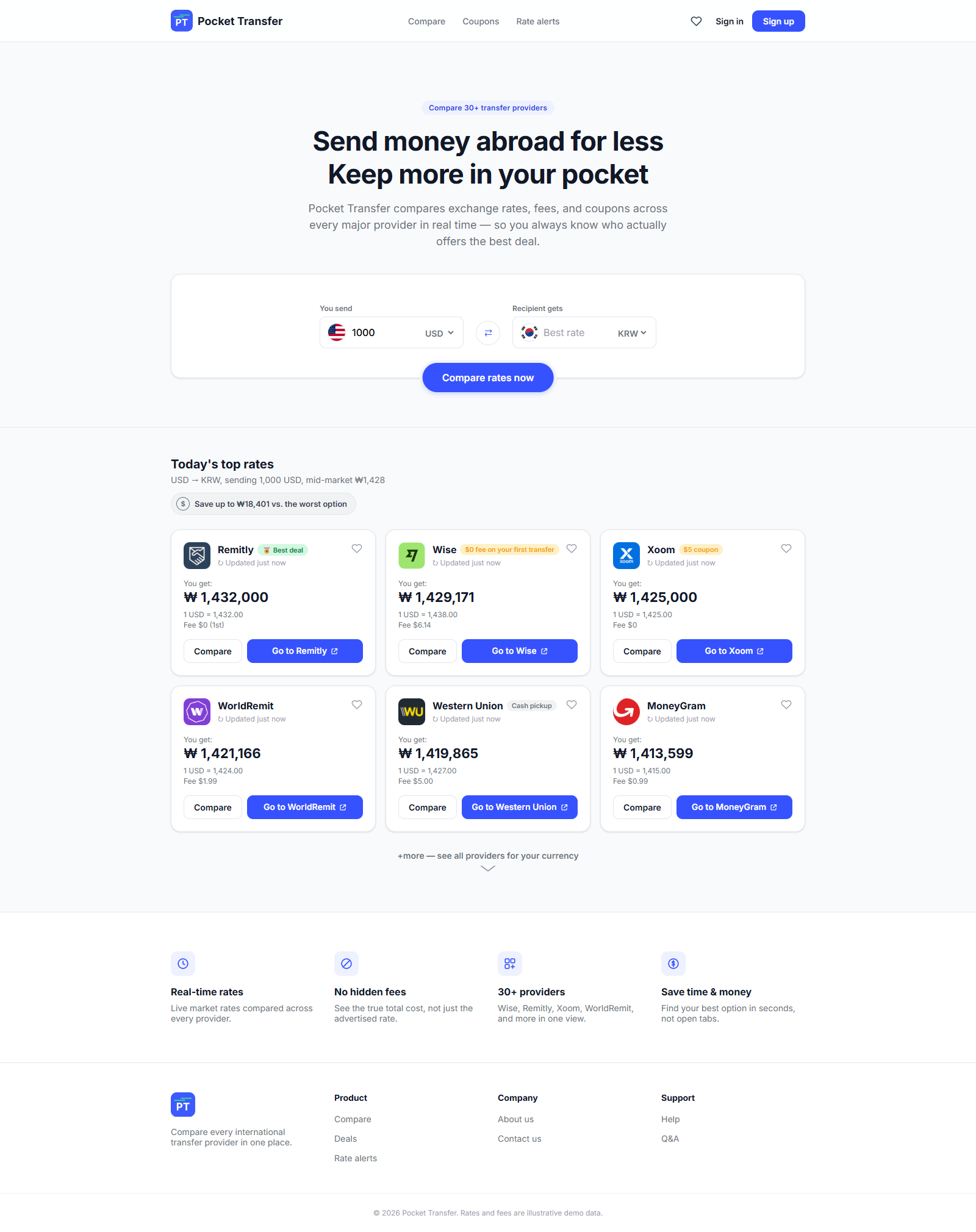
I sketched six versions of the comparison results screen, prioritizing what research showed matters most. The refined version leads with the amount the recipient actually gets, keeping fee, rate, promo, and delivery time visible without extra clicks.
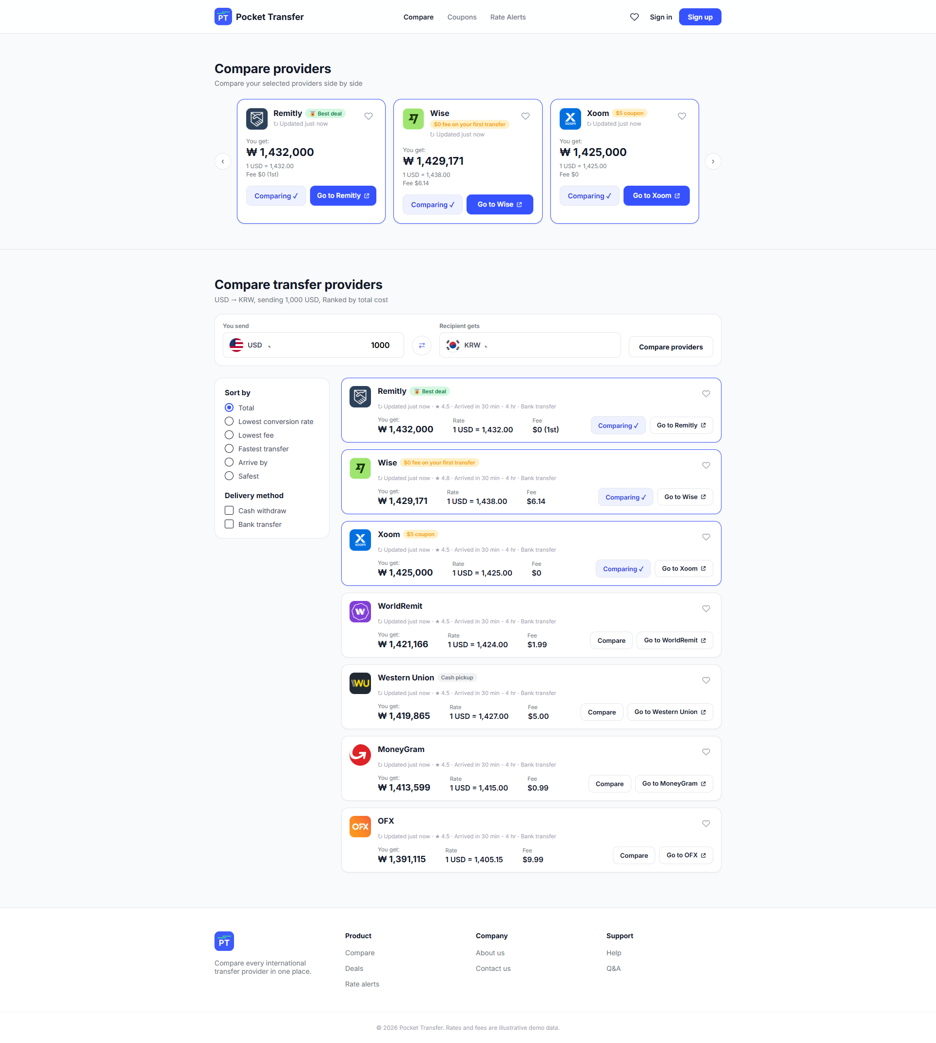
Providers are ranked by amount received, so the best overall value always appears first. Each result card shows the fee, exchange rate, and applied promo up front — no hidden costs.
The prototype connects the core path: enter transfer amount and destination, compare live provider quotes, review the cost breakdown, and continue to the chosen provider — no account required to start comparing.
From six paper explorations of the results screen to a connected low-fidelity flow and the high-fidelity build — every screen leads with the amount the recipient actually gets, keeping fee, rate, promo, and delivery time visible without extra clicks. Click any screen to enlarge.
I conducted two rounds of moderated usability studies with five participants each: round 1 tested the low-fidelity prototype and round 2 tested the high-fidelity mockups. Findings guided the designs from wireframes to final mockups.
Pocket Transfer makes cost transparency the default.
"I can finally see what a transfer really costs — this would save me money every month."
— Usability study participant
I learned that trust is designed, not claimed — showing the math behind each quote changed how users felt more than any visual polish. I also saw how quickly early assumptions fall away once you talk with real users.