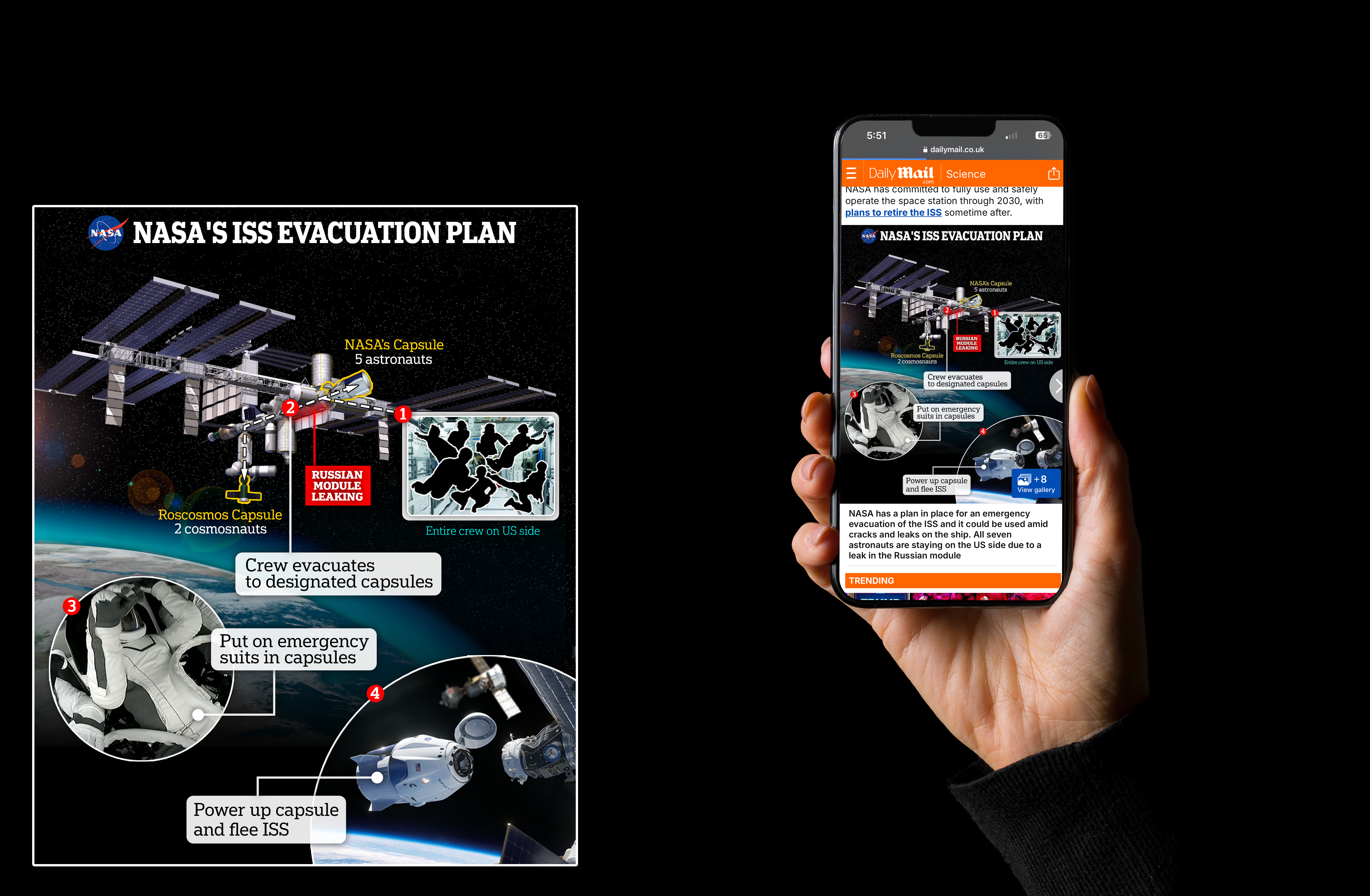
Sicence Infographic: NASA's ISS Evacuation Plan
View the ArticleThis infographic explains NASA’s emergency evacuation plan for the International Space Station (ISS), outlining the step-by-step process astronauts would follow during a critical incident—entering designated capsules, donning emergency suits, powering up the spacecraft, and detaching from the ISS to return safely to Earth. Designed for mobile and digital formats, the visual distills a complex protocol into a clear, reader-friendly narrative.
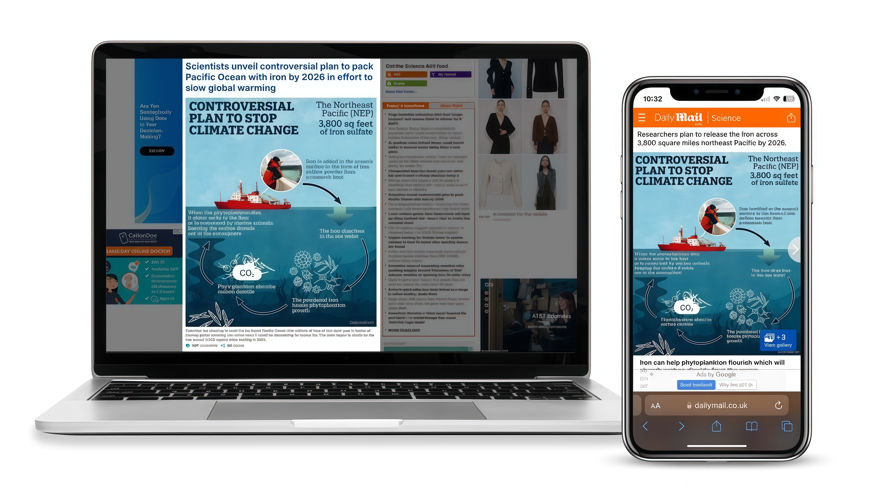
Environmental Infographic: Controversial Plan to Stop Climate Change
View the ArticleThis infographic illustrates a controversial geoengineering plan to combat climate change by releasing iron sulfate into the Pacific Ocean by 2026. It sequentially explains how iron fertilization could stimulate phytoplankton growth to absorb atmospheric carbon. Featuring a modular structure and strong visual hierarchy, the design transforms complex scientific content into a clear and intuitive visual language, aiding the understanding of the accompanying news article.
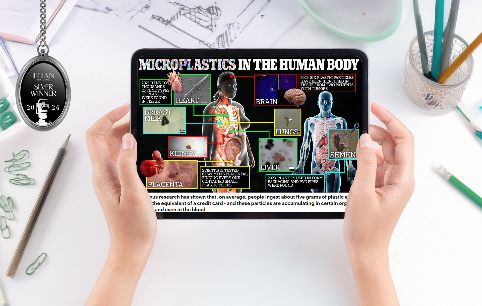
Health Infographic: Microplastics in the Human Body
View the ArticleThis award-winning infographic visualizes recent scientific findings on the presence of microplastics in various human organs, including the heart, brain, lungs, kidneys, liver, placenta, breast milk, and semen. It highlights studies from 2022 and 2023, using clear imagery and color-coded callouts to communicate complex data in an accessible format. The infographic was designed to raise awareness of microplastic contamination in the human body and was recognized with a 2024 TITAN Silver Award for excellence in visual communication.
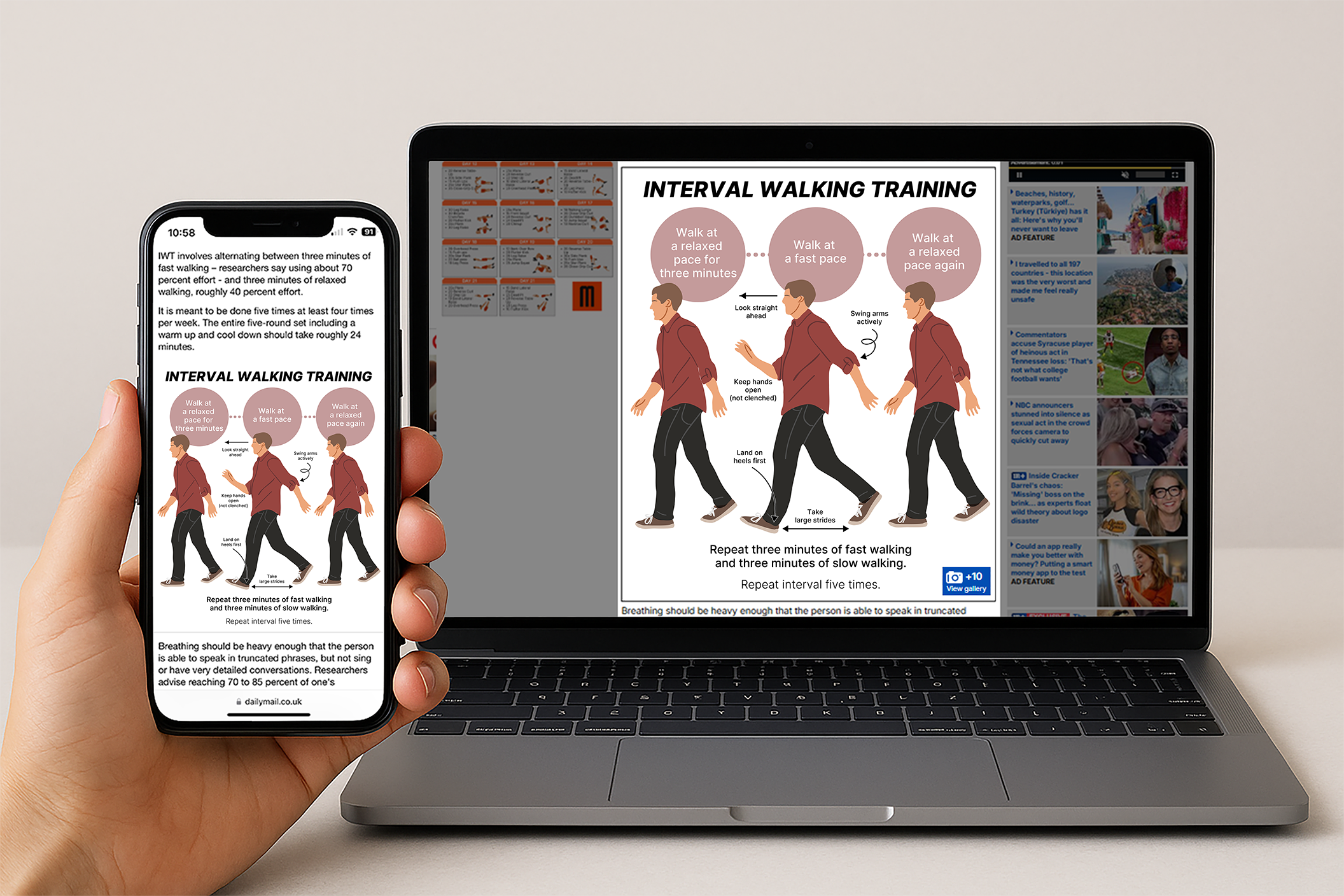
Instructional Infographic: Interval Walking Training
View the ArticleA clear and engaging health graphic designed to explain Interval Walking Training (IWT). The infographic combines instructional text with step-by-step illustrations to guide users through alternating fast and relaxed walking intervals. Key visual elements such as posture cues, stride direction, and pacing icons make the routine easy to follow while maintaining an approachable and informative tone.
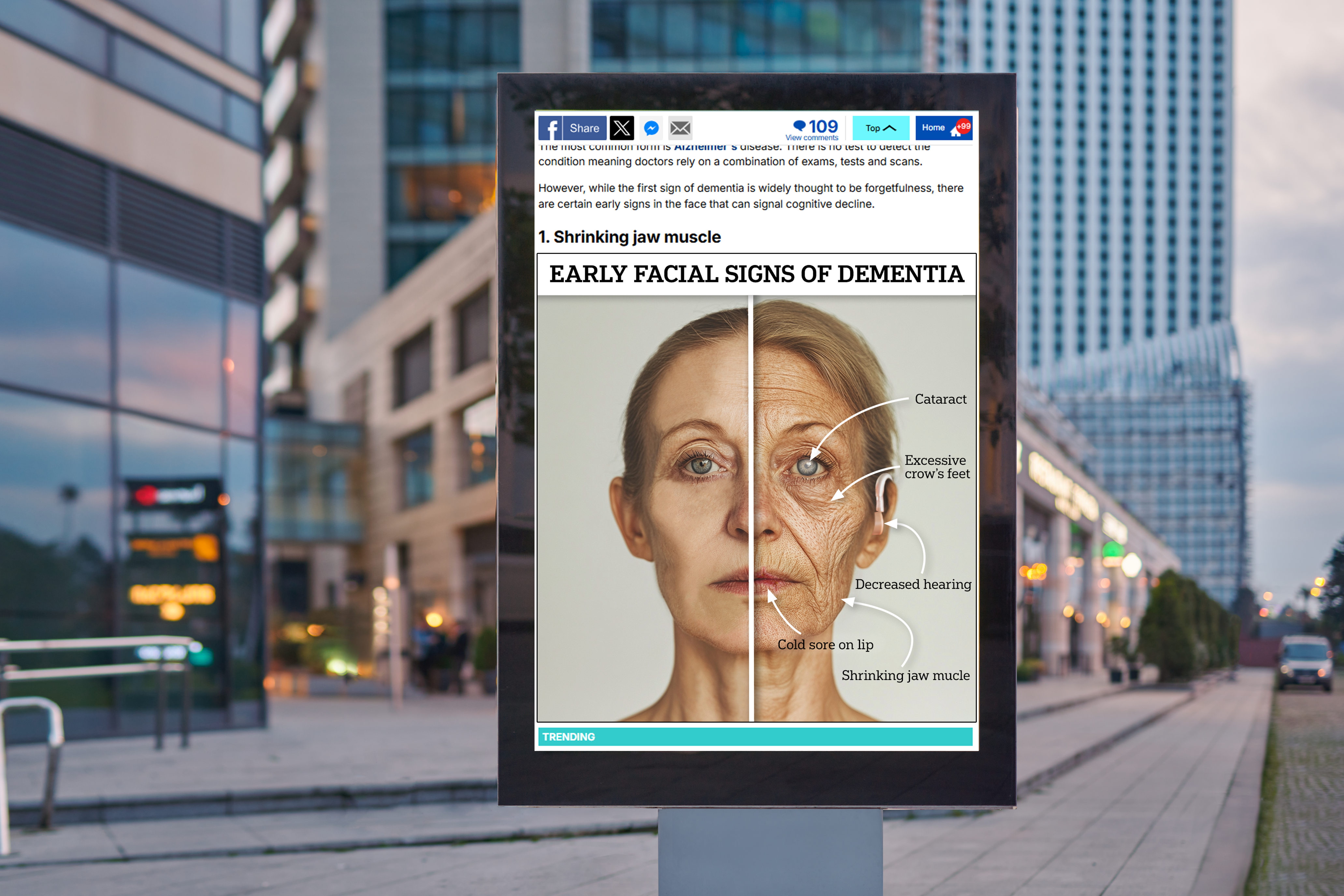
AI-Prediction Graphic: Early Facial Signs of Dementia
View the ArticleThis AI-powered graphic visualizes how subtle facial features—such as wrinkles, muscle loss, and perceived aging—can signal dementia risk decades in advance. By highlighting key facial regions, the visualization makes complex medical predictions clear and accessible.