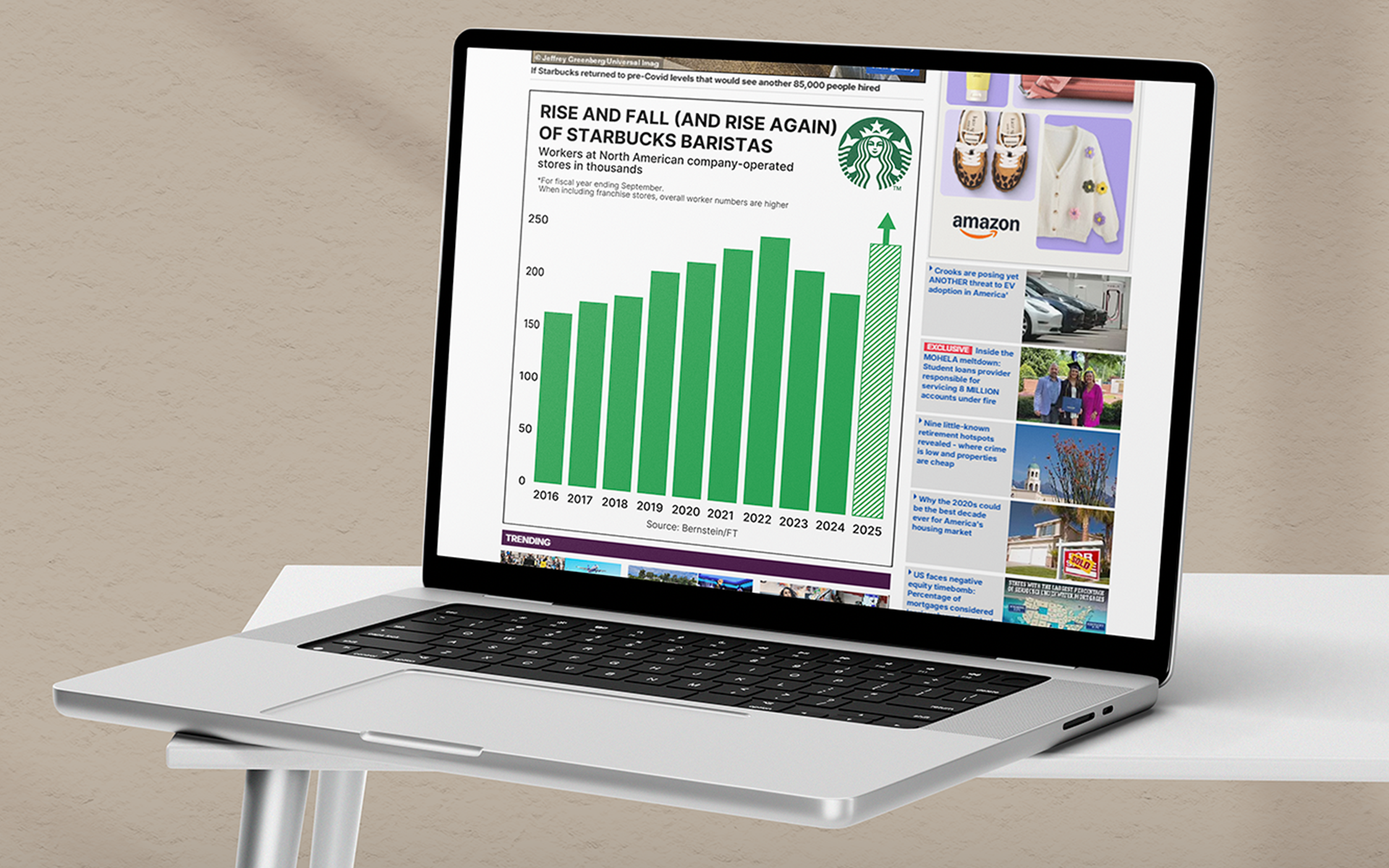
Starbucks’ Green Apron Model: Streamlining Staff for Better Service
View the ArticleThis U-shaped graph illustrates Starbucks’ staffing journey: high pre-COVID levels, a dip during cost-cutting that impacted service, and the current hiring surge aimed at restoring efficiency, customer experience, and employee morale.
Tesla Stock in Motion
Hover over to interact!
View the Article
This data visualization underscores the sensitivity of Tesla's market valuation to public perceptions of its leadership.
Nitrate in US Drinking Water
Click to interact!
View the Article
This interactive, color-coded map reveals U.S. groundwater nitrate hotspots, highlighting a growing environmental and public health threat.
Federal Interest Rate since 2011
Hover over to interact!
Open in a New Tab
This interactive timeline graph shows U.S. Federal Reserve interest rate changes, revealing trends and key policy shifts over time.
Prostate Cancer Incidence Rates Across U.S. Counties
Hover over to interact!
Open in a New Tab
This interactive map visualizes prostate cancer incidence across U.S. counties, using color-coded age-adjusted rates to highlight regional disparities and help identify areas for targeted public health action.