
1. The Challenge: Bridging the "Mobile Gap"
In the high-velocity Daily Mail newsroom, complex data graphics were traditionally built as high-fidelity static images. While they looked great on desktop, they failed the mobile audience.
Mobile traffic as of 2025
2. User Research & Pain Points
Through user testing and heatmaps, we identified four primary friction points that led to high bounce rates on data-heavy articles:
Pinch-to-Zoom Friction
Users abandoned articles when forced to manually zoom to read text on a grpahic.
Information Density
Graphics failed the "glance test" on 6-inch smartphone screens.
Aspect Ratio Mismatch
Landscape graphics created dead space and "micro-text" on vertical displays.
"On my phone, the graphics are so small that I can't read them without zooming in. It breaks the flow, and I end up skipping the information altogether."
— Margaret, Daily Mail Mobile User (48)

3. Design Strategy: "Responsive Visual Storytelling"
| Feature | Mobile-First (68%) | Desktop-Optimized (22%) |
|---|---|---|
| Layout | Vertical Stacking: Components stack for scrolling. | Horizontal Spread: Side-by-side data viz. |
| Typography | Legibility First: Min 12px; high contrast. | Detailed Hierarchy: 12px – 16px range. |
| Interactivity | Touch-Friendly: Tap/Swipe cards. | Precision: Hover tooltips and clicks. |
4. The "Dual-Path" Implementation
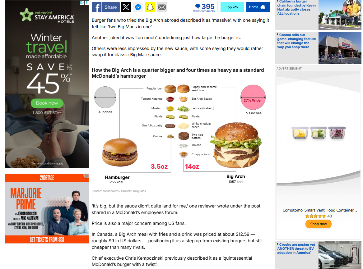
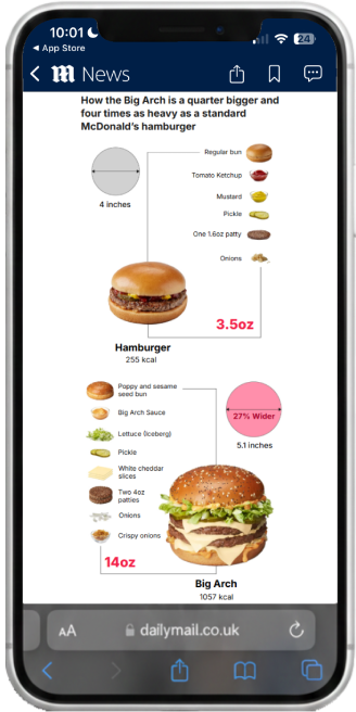
From JPEG to SVG
Switched to vector-based rendering for infinite scalability without loss of clarity.
Conditional Loading
Developed a system that detects device type to serve either a "Simplified Vertical" or "Detail-Rich Horizontal" version of the same data.
Adaptive Assets
Using ai2html, I converted Illustrator files into HTML5 containers that reflow text dynamically based on screen width.